Evolution of the Nyx Sign
Author: Flosha
Written: 18.11.2023
Last update: 04.09.2024
The “Sign” is the oldest of our logos. The sign was designed before there was any other “logo”. We call it the Phoenix “sign”, or the “Nyx logo”, due to its form and the name of the project at that time.
When the project was started, we called it “Project Nyx”. Phoenix was a term we knew that had some kind of relation to Gothic, but we assumed it was mostly related with the engine. We did not know yet that it served as a working title of the game itself after the Orpheus phase, when Piranha Bytes was founded (Orpheus was conceptualised before that, which is also the reason that PB and THQ have no rights on these concepts, they belong to Mike).
With this working title “Nyx”, we had something that sounded dark enough, like Gothic and was at the same time a name from greek mythology, like Orpheus, Nemesis etc. (you may know the relation of these three from our FAQ).
And now we had to get some kind of logo, a sign or a symbol. There is a specific tradition among retro games to have some kind of sign associated with them. For instance, Unreal Tournament is known very well by the “U” in their specific style that also serves as their “icon”. Another well known example is the Half Life logo, the lambda by which everyone recognises the game. But to me the most iconic logo of them all is the sign of Quake.
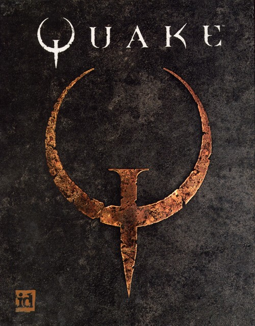
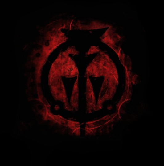
I was inspired mostly by the Quake logo when I started to experiment with a logo for Nyx. Another inspiration for it was the sign here on the left. But I don’t remember anymore where I have it from and what it means.
![]()
This was one of the first ideas, using the most “archaic” looking style of the early Gothic logo from the time when the letters did not yet have a “frame” as in the later designs.
But this was just the “Y” of NYX. I also needed the N and X. My idea was to combine all the three letters in some form.
In a transitional stage I made this below. This specific form of the “N” is a sign that Mike has always used in the context of fire mages for some reason.
![]()
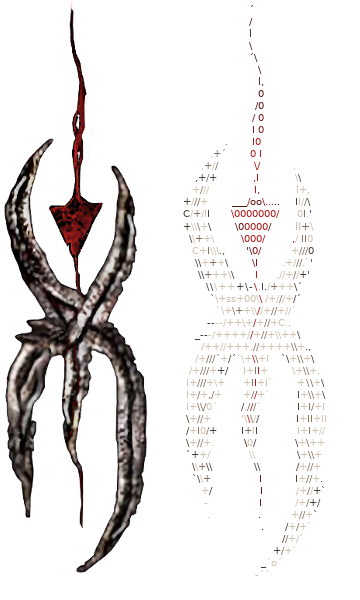
But then I had the idea of this blood running through the sign and in a triangular shape and made this:
![]()
A more or less conscious inspiration for this may have been the sign from Prince of Persia: Warrior Within (another example for a very cool logo associated with a game), which is inspired by the Cuneiform - the oldest known writing system as used in Mesopotamia.
In the Prince of Persia sign there was also blood running through the it, but filling it completely, before the colours would be inverted to leave the sign to be an empty black, as seen above.
Since I wanted to combine all three letters, it evolved into this:
- N and Y form the X.
- The Y at the same time serves as a metaphor for the sceptre of varant, that plays an important role in the story.
- Blood flows into the Y, open upwards, symbolism of sacrifice, like a sacrificial bowl (in this context blootearth clan, persecution of heretics, dark forms of magic, blood ore, war and all these important story related things) but if seen as an upward motion it can also be compared to a bud, in form of the triangle turned upside down, which is a symbol of the revolution and uprising. In this context I had made another version of the logo where instead of the blood running down, a flame is rising up from within the “Y”; and only now when thinking about it, I imagine that we could nicely combine these two approaches in an animation, where at first the blood is running downwards through the sign and then transforms into fire rising up -> the revolution (liberation from outside) and the phoenix (liberation from within) are nourished by suffering and blood.
ToDo: Create and add image/gif of this.
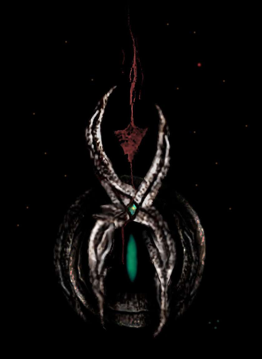
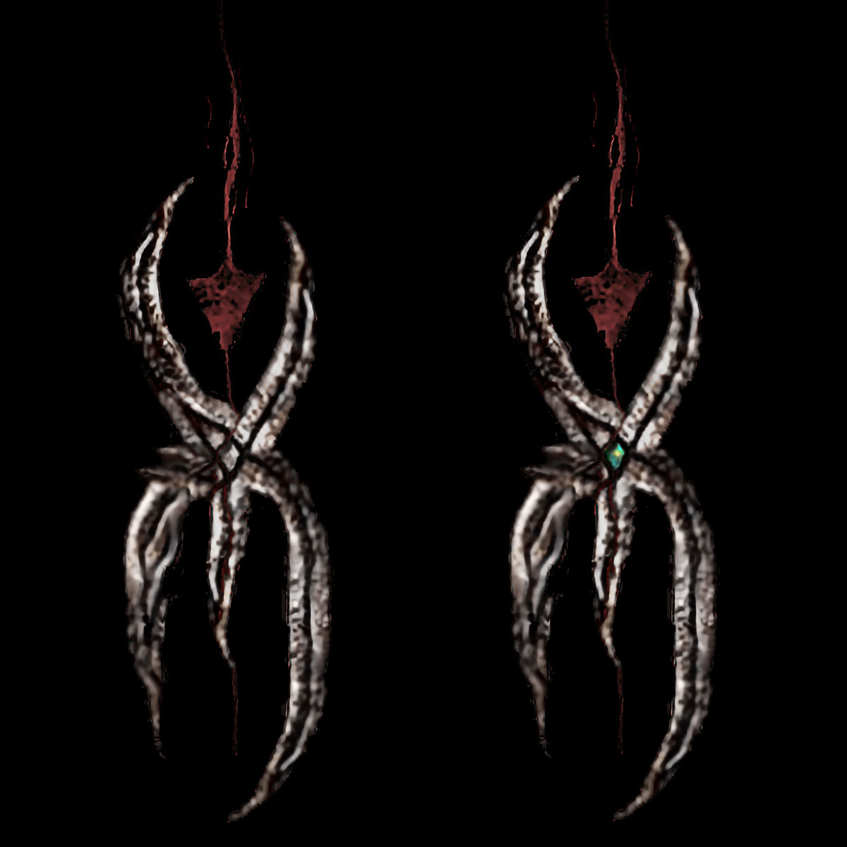
Many details were changed over the years. At first the black lines that the blood runs through and that are running through the middle of the letters were just connected by crossing in the middle of the “X” (where Y and N connect). By trying to improve this shape I got the idea to let them run around a central elevated form instead, which exists in both a simple stone version and in the green gem stone version below. A little detail that I think improved the sign a lot.
While at first it served primarily as a logo for the project and its working title “Nyx”, over time the meaning became more and more profound and with more associations with older original ideas.
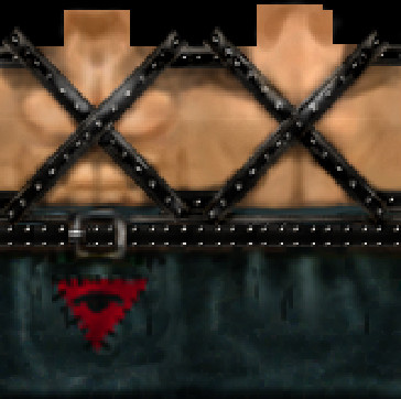
One example is, that when designing the upside down triangle I had no idea that this very same symbol was a sign of the “Rächer” (Avengers), the templars of the brotherhood, as seen on the templar armor in 0.64b, which we did not have at the time of the sign’s creation.
This way what I originally conceived as a symbol for the more rebellious anti-king and anti-clerics faction in Act 2, which combines the mystics experimenting with the old ways of magic and psionics beyond the old constraints of the brotherhood (which includes a few of those former sect members who did not become insane, who accepted the “truth” about the demon but did not give up their fascination for the mystery of the psionic powers) with the rebellious thieves and spies who work against the crown, had now also an association with (a subgroup of) the former sect - quite fitting.
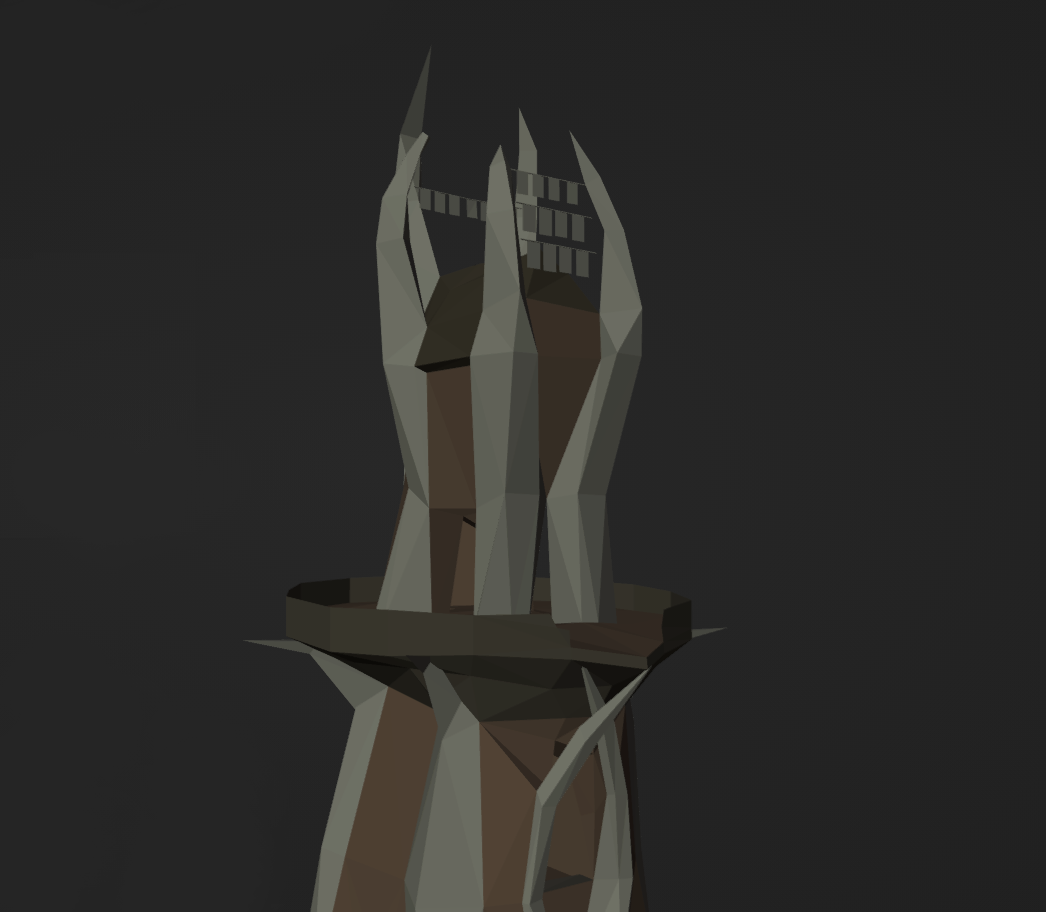
In a similar way I also only realised much later that the shape of the Y I made in the sign is almost exactly corresponding to the spikes at the top of the original Demontower, which I reconstructed based on the original tower (which was later re-used by the level designers in form of the sunken tower) and the different concept arts.
These associations led to all kinds of explanations and lore (a meaning of the shape, function of the tower etc.) and thus, over time, the symbol became much more than a mere logo outside of the game. It has now lots of meaning even inside of the game, especially in association with the bloodearth clan (the Orcs who guard the sealed portal in fear of the awakening of the demon they summoned thousand years ago). Outside of the game, for promotion purposes, it is just an additional graphics we use to represent the project, but then the players will be able to discover this very sign within the game and slowly realise the different meanings behind it.
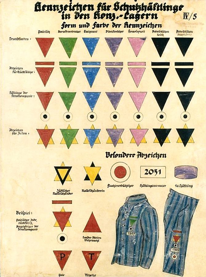
The latest aspect we became aware of and I did not know when I designed it (Avallach pointed it out to me a few months ago), is that this red downward triangle was a sign during the Third Reich. It was an emblem used on the clothing of all prisoners that were brought into concentration camps for political reasons, such as anarchists. Which, for what we use it for as a symbol of the revolution, is just another very fitting coincidence.
In 2023 I re-imagined the logo again. At first, when the project started, we planned with two different modifications. Orpheus (now Act 1) and Nyx (now Act 2). In order to have a sign for Orpheus alongside the Nyx sign I was doing a draft for Orpheus too.
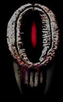
Still very rough and not as iconic. The idea was that the “O” for Orpheus is at the same time a representation for the dimension portal through which the Sleeper was summoned from the demon world (and you know, Orpheus had to travel to the underworld…). Therefore the threatening, dark red light emitting from within the O, almost like a demonic eye. I also added the teeths from the Sleeper mask, although I was never sure about them. And I imagined it to be cool to have an “O” icon for this part of the project instead of the Gothic “G” (while I had no idea yet what the icon for Nyx would be - now it is the red triangle for the project as a whole).
When the project was renamed to Phoenix as one coherent drama for both acts, with “Project Nyx” as the working title of both and Orpheus/Nemesis as the names of the acts (as of now), the Nyx sign became an universal sign for the project and not just for one part of it, while the Orpheus sign became obsolete and did not appear anymore on our websites.
But there was always one thing about the Nyx logo that I think was just not looking quite right and that I was never fully happy with. And that was how the bottom part of the Y was going through the N. While it made sense in order to fully represent the letter, it created a disharmony in the overall form. At the same time I missed one aspect of the Orpheus sign, this threathening light behind the portal. Therefore, in the latest version of our logo I ommitted the lower part of the Y, thereby creating a more harmonious form, and added what I missed from the Orpheus sign, which created new layers of meaning in the symbolism without destroying the old.
Now the Y with the blood and the triangle (and fire) show the struggle, the sacrifice, the anarchy at the surface, while the N serves as a representation of the underworld and the demonic threat below. And while the Y stands for the sceptre and the “sacrifical bowl” and the summoning spikes and so forth, the N stands for the portal to the ancient temple as seen in the OrcCity with this very form, as it will be unsealed in course of the story. There is room in the middle of both letters and they are roughly the same size - just as in Phoenix, the underworld is supposed to be about 50% of the game. Thus, I think, the current version of the logo represents the project the best and contains the most symbolic meaning.
But most likely the sign will keep evolving further…